College Magazine Analysis 1

This college magazine front cover connotes that college is a
happy place to be as the model is smiling with a relaxed body posture. The anchorage text for this front cover is
located around the image and is short and snappy however getting straight to
the point. The choice of text and the wording entices you to read the contents
of the magazine as it is what the target audience want to read about. The text
relates straight to the target audience as the language that is used is the
same language teenagers/young adults use at college.
The institutions for this magazine are that it is based in a
college and can be found on the college website and around the campus. This
magazine is from the SMU campus in America.
The ideology denotes the fun aspect of college life. The
female model is youthful and the same age as the target audience. Her t-shirt
reads ‘I love (love heart) SMU’ which suggests that she is happy and content
studying there. This is an intertexual link with the text reading ‘A new kind
of balancing act, Nastis Liukin on SMU’s campus’. I expect that the model
herself is Nastia, she is likely to be a well-known figure around college,
possibly a cheerleader. The model is in
the foreground. The photographer has
used a medium long shot with the avenue of trees on the college campus in the
background. This suggests that college life is not just about studying but
getting out and enjoying the weather with friends.
The articles in the magazine are highlighted in the sell
lines. Drugs are possibly the norm in college and students live on a budget.
One article ‘Smoking salvia- the truth behind the legal drug’ suggests that
college students will grow their own drugs from salvia plants however there are
risks to be considered when doing so. Another article ‘ Sleeping your way to
the top’ can engage the reader as colleges are well known for both gossip and
promiscuity. The third magazine refers to ‘beer’ again colleges have a drinking
ethic and many of the lads will be interested in this article. The last sell line
talks about teenage pregnancy – every college girl’s worst fear whilst
studying. Having stories which engage and attract the reader will increase
demand for the product.
College Magazine Analysis 2
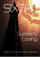 The Blackpool 6th form college magazine June 2013
issue features a single main image of the iconic Blackpool Tower structure. The
intertextual links featured are the sun shining brightly down from the highest
point on the page- seemingly higher than the tower itself- this image links
with the Anchorage text ‘Summer’s coming’. The upwards tilt shot emphasise the
height of the structure. This connotes that Blackpool 6th college is
one of the best colleges as it ‘towers’ above the rest of the local post 16
colleges and 6th forms. The colour scheme used also suggests that
the photo was taken at dawn- again suggesting that the light/ sun is coming.
The Blackpool 6th form college magazine June 2013
issue features a single main image of the iconic Blackpool Tower structure. The
intertextual links featured are the sun shining brightly down from the highest
point on the page- seemingly higher than the tower itself- this image links
with the Anchorage text ‘Summer’s coming’. The upwards tilt shot emphasise the
height of the structure. This connotes that Blackpool 6th college is
one of the best colleges as it ‘towers’ above the rest of the local post 16
colleges and 6th forms. The colour scheme used also suggests that
the photo was taken at dawn- again suggesting that the light/ sun is coming.
The language is simple and wording immediately engages with
the young 6th form
readership. It is likely that this magazine will be available for the Year 12
and 13s based at the college but also possibly for the local Y11’s in feeder
schools so that they can get a feel of what is hip and cool on the college
scene.
The headline ‘Sixth Sense’ is in the same position as in earlier editions and uses the standard
font in capitals letters for reader recognition. This is part of the magazines
brand identity with the words been at 90 degrees to each other. The font is
clean and modern and easily readable.
Features
in the magazine are easily highlighted with little explanation across the strap
line: ‘Xbox one- Poetry Day-Festival Fun-Blackpool Pride’. The content should
appeal to the range of students attending the college as the articles cover
gaming, social opportunities, English Literature i.e. studies and the Blackpool
Pride Festival. The magazine does not require any prior knowledge from the
reader.
College
Magazine Analysis 3

There are 2 male, black basketball
players shown on the cover of this
magazine. They are the typical stereotypes of
the basketball players of the university/ college scene. The team mates
are dressed in their team kit- Trojans 32. They have a determined stance with
an almost arrogant facial pose which is connoting their determination to win or
as the intertextual link states ‘ The Takeover- Bill Walker and CJ Mayo are
ready to take the hoop world’. This information will be relevant to those
interested in college sports in California. The object code of a basketball is
used so the reader is clear on what sport the men play.
Technical codes-The main colours
used a re black background with contrasting white and yellow font. The typeface
is very regular in style and is mostly in capitals for increased emphasis.
These colours look well compared to the white and red basketball uniform. The
image elements are all in focus. The camera angle is a low angle, medium range
shot - this is to emphasis the status of these 2 successful players. The reader
will look up to their college heroes.
Text included on the cover has a
clear language, the font colour
alternates as the reader scans down the story lines. The story lines are
located on the left hand side of the image to aid visibility on the magazine
rack. The text makes references to sport especially basketball. Other articles
are listed but to the general reader their content may not be obvious e.g. Seton or La Salle. The main function of the
messages on the cover is to engage the reader in learning who is number one in
college sports currently.
The target audience are American
college students especially those based in the area of California hence the
featured Trojan 32 team. This magazine could be available on line or on
newsstands under college magazines. It is likely that the magazine will have
national distribution within America.

